Hyland’s x SCAD
Introduction
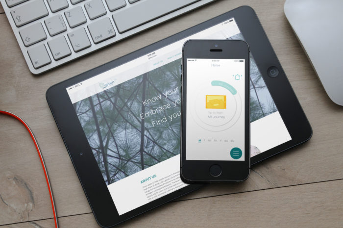
SCAD partnered with Hyland’s to create a 10 week Collaborative Learning Course for students to solve a design prompt. The prompt for this course was to create a full 360 degree beauty experience. This would include a new brand complete with a logo, package design, a product website and accompanying app, and a branded content film. As a class we created a brand system called Groov, and in this page I will detail the digital portion of the full project.
Partners
SCAD + Hyland’s
Services
360° Beauty Experience
Year
2016
Tools
- Illustrator
- Webflow
- Proto.io
The Team
After initial research and concepting as a class, we broke into three main teams to further concept and prototype different facets of the project. The three teams were digital, packaging, and video. I was a part of the digital team, which consisted of Kailey, a graphic design and advertising minor student, Ariana, an illustration and game design minor student, Jingyun, a graduate interactive design student, and Sander and myself, both in interactive design. At first we concepted together as a group, then divided into two teams to target both the website and app. Ariana, Jingyun, and Sander focused on designing the mobile app while Kailey and I focused on the product website. Jingyun and I created a prototype of the app in Proto.io, and I created the website using Webflow to show the clients a clickable page during the final presentation. The site is not live as the product is still in development.
Process
Research
Our digital team brainstormed potential features of the digital portion of the Groov concept that would provide users with a meaningful experience over the course of the product’s weeklong duration. We tested several existing apps on their usability, functionality, and design. We also included interactive experiences such as gift giving, journaling, and augmented reality to provide creative ways to keep users engaged with the brand.
Target Audience
We found our target audience included young professionals and health conscious adults, but expanded our market to include college students because of a current trend in natural and organic beauty products targeting younger adults.
Wireframes
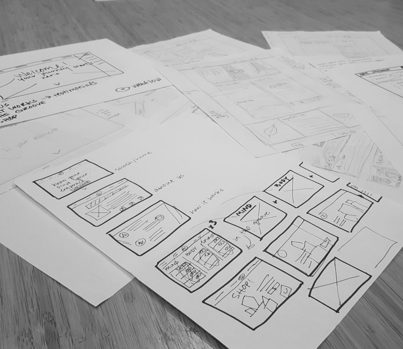
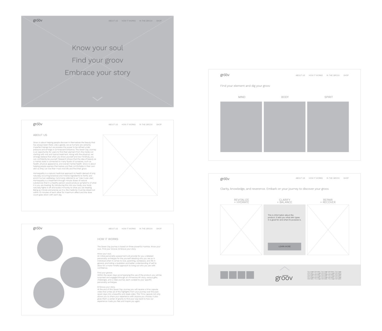
After understanding who and what it was we were designing for, Kailey and I began sketching and wireframing possible layouts for the product website. We decided on a single scroll site to showcase the three types of Groov products, and went to work creating digital wireframes to layout each detail.
Final
Website
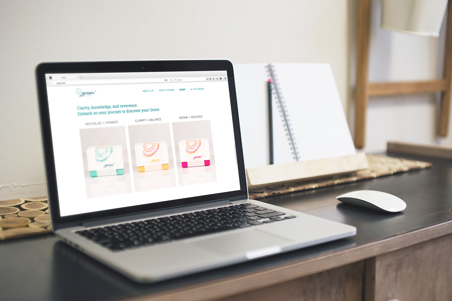
The website will serve as one of the first touchpoints a user has with Groov. This site will briefly explain the power of homeopathy and how their facial product and mobile app duo will benefit them, and as users scroll down to the bottom they will reach the Shop page where they can purchase one of the skin care products.
Mobile App
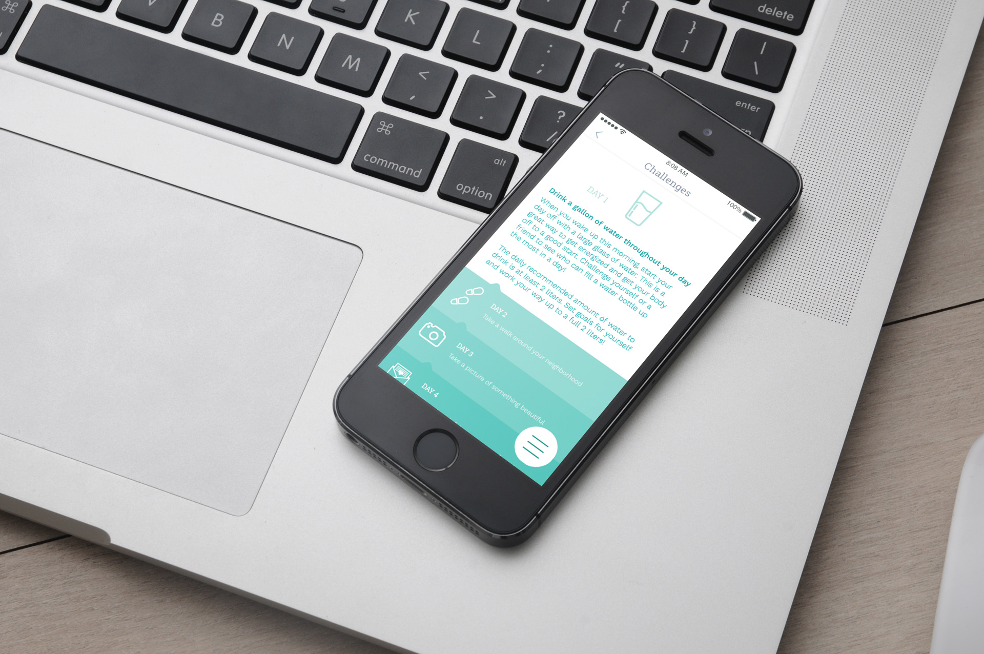
Jingyun and I gathered the assets created from the mobile app files and animated them in Proto.io to show how the app flows on a user’s first day. When users first sign up, they will be able to immediately start their first day using the Groov facial beauty system. The app will prompt them to take the dissolvable tablets and provide them with daily challenges and gifts to help them feel engaged and inspired. Nightly video journaling will be recorded and placed in a time capsule in the form of a highlight reel of their week using the Groov beauty system. This video will serve as a memory of their experience using the product to share with others and look back on in the future.
