Flye
Introduction
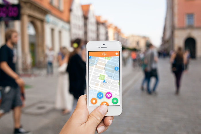
Flye is an educational scavenger hunting app for families and students that uses geolocation to unlock and complete hunts. We partnered with its creator, Tour Buddy Apps, to re-conceptualize a design for their budding project. In order to take this concept further we delved into principles of gamification and how to better engage with and learn about one’s environment.
User Story
We have created a walk through video that explains the core functionality of the product through the eyes of the user.
The Team
Process
Research
We began by analyzing Flye’s present competition. From apps such as Pokemon Go, Foursquare, and Scavify, we found that many competitors weren’t providing enough updated content to keep users hooked. Some also password protected their content, making them exclusive to certain groups. From this research we found an opportunity to set Flye apart by making it more inclusive to a larger audience.
Gamification
We also met with two Senior Game Design students to talk about utilizing principles of gamification in order to create a strong foundation for a long lasting service. From this research we found that we should:
- Find a balance between instant gratification (base rewards) and long term (meta) rewards
- Make users feel awesome and give them choices that affect their game play
- Focus on the logistics of leveling up, i.e. faster in the beginning and slower down the road
Interviews
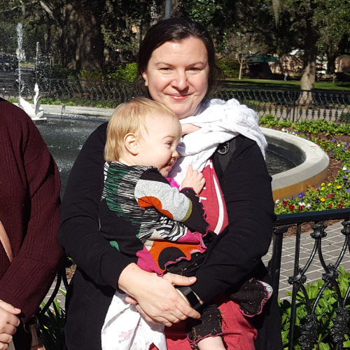
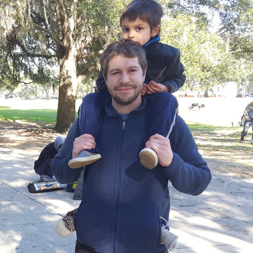
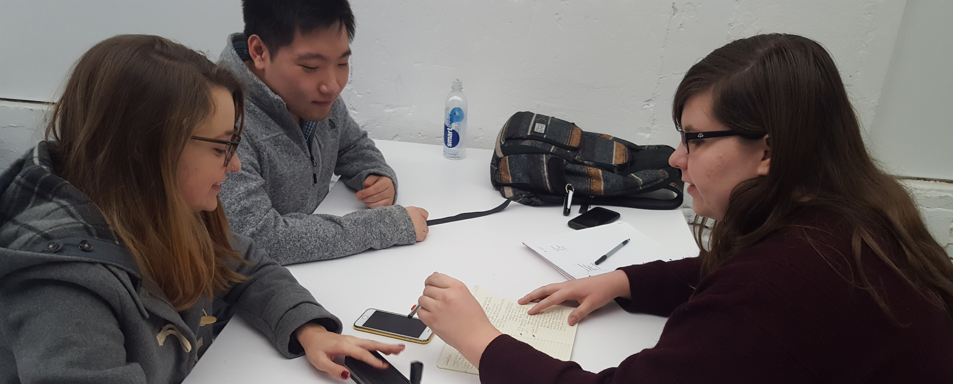
Next we conducted interviews with families in Forsyth Park, and found that they would like to see an app that:
- Will not distract from the current environment
- Offers leveling systems and regularly updated content
- Educates them on the location they are visiting and keeps their brains active
- Offers incentives for clearing hunts, such as treats or coupons to redeem in town
Sitemap
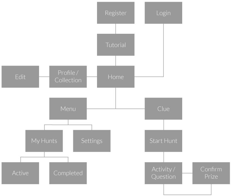
After compiling our research and findings, we created a layout of the revised app architecture. After registering or logging in, users are brought to the home screen where they have the option to view and edit their profile, begin a hunt, or open the menu to access their hunt activity and settings. Once a hunt has begun, users will enter a cycle of completing activities and receiving sticker prizes as they go through scavenger hunts.
Sketching & Prototyping
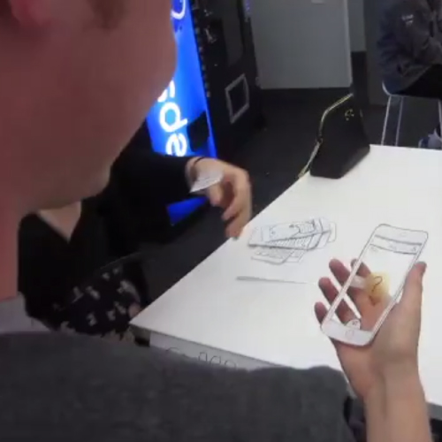
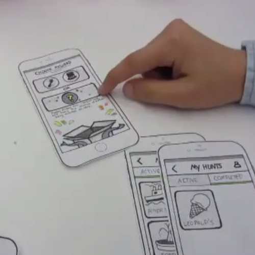
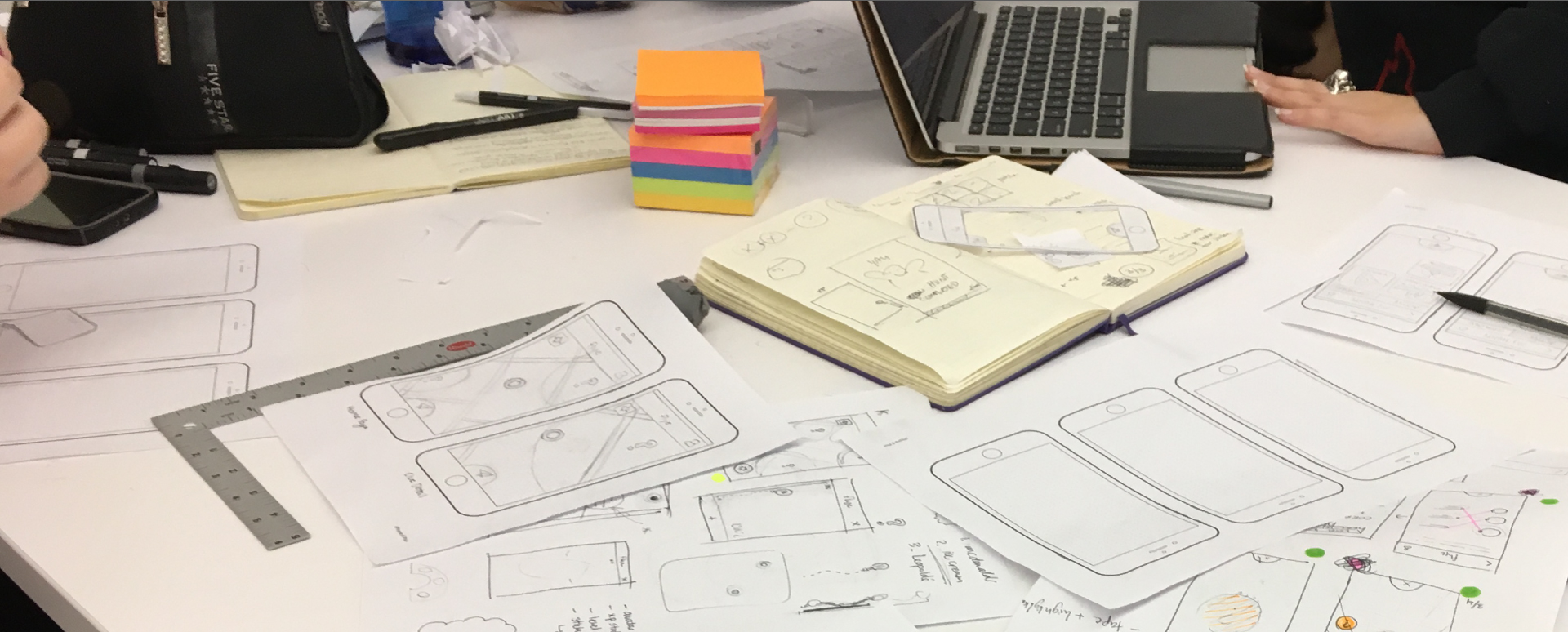
After experimenting with different potential screen layouts, we created a paper prototype in order to test the usability and wayfinding of the revised layout.
User Testing
Volunteer testers walked through a mock scavenger hunt with the prototype and gave feedback on overall usability, including any pain points they encountered. The results from this allowed us to revise the layout and forward from functionality into the final high fidelity design.
Final Product
Walk through a sample scavenger hunt at Leopold’s ice cream and see Flye in action. It may take a moment to load.
Search for Clues
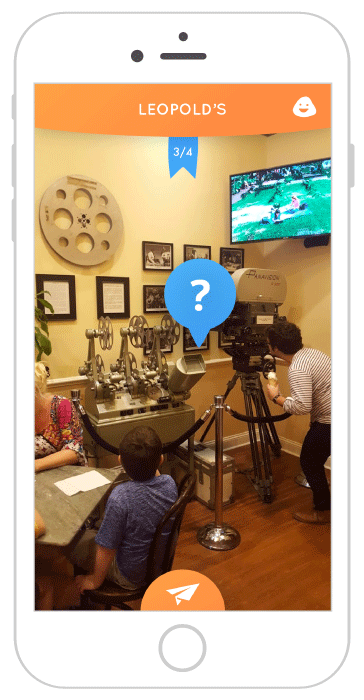
Flye uses geolocation and provides special clues to lead you to nearby scavenger hunts. After beginning a hunt, search all around for hidden clues using augmented reality
Play Games
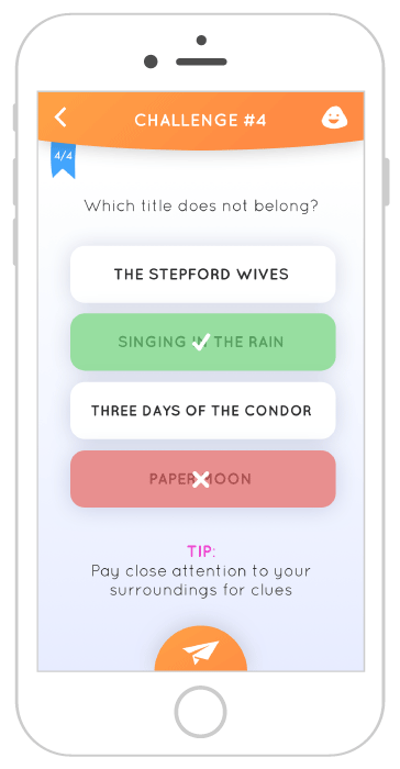
Once you find a hidden clue, you can unlock games and answer trivia related to that location
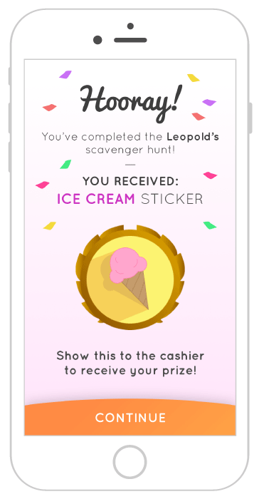
Earn Rewards
Receive stickers and other special prizes by completing challenges and games on your hunt
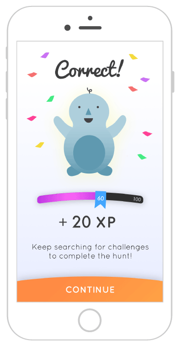
Level Up
Earn points by playing games, answering trivia, and completing scavenger hunts in order to level up
Customize your Avatar
Show off new stickers by equipping them on your avatar
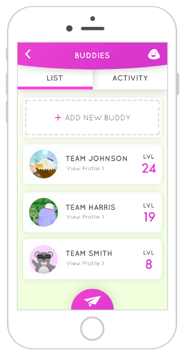
Socialize with Friends
View your friends' avatars and see their recent progress
Impact
At the conclusion of this project, we presented a walk-through of our research and the final prototype to our client at Tour Buddy Apps and handed off the project to be incorporated into their app moving forward. At the start of the summer they began gathering a team to work on implementing the new functionality and designs to Flye, and at present are still working on this project.

