Bank of America
Introduction
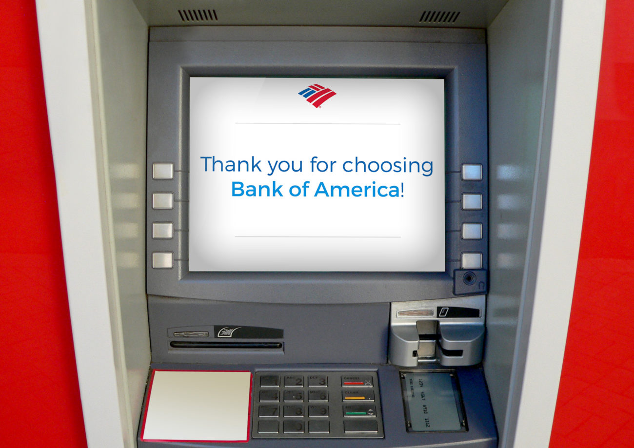
I partnered with Carly Reagan and Zack Haynie to rework the design of Bank of America’s ATM interface.
Research
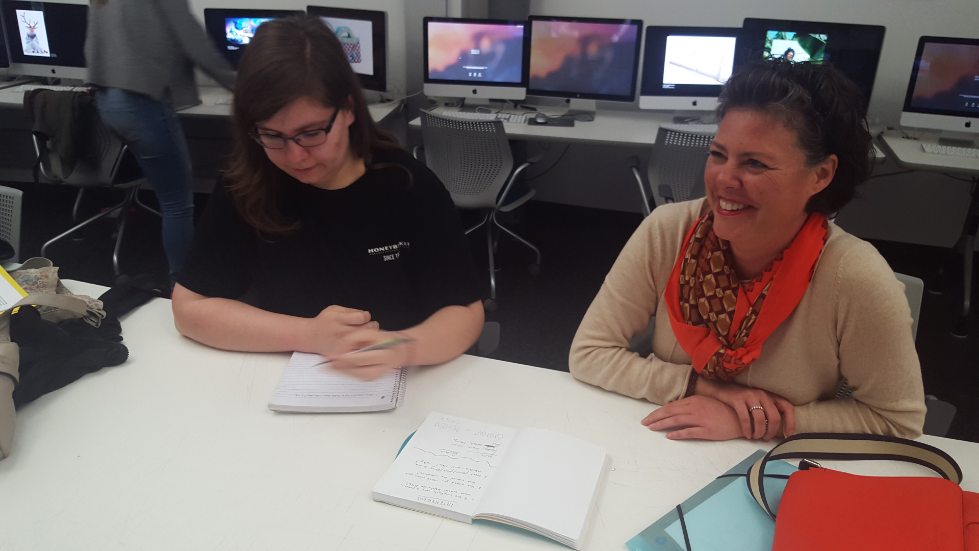
We used card sorting and in person interviews to learn about what traits users are looking for in an ATM interface. From this, we found that users want an interface that feels smart, honest, clean, and friendly.
Sketches
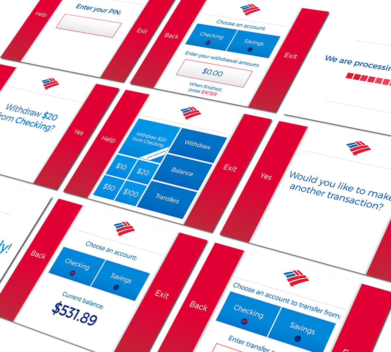
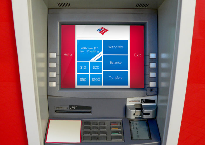
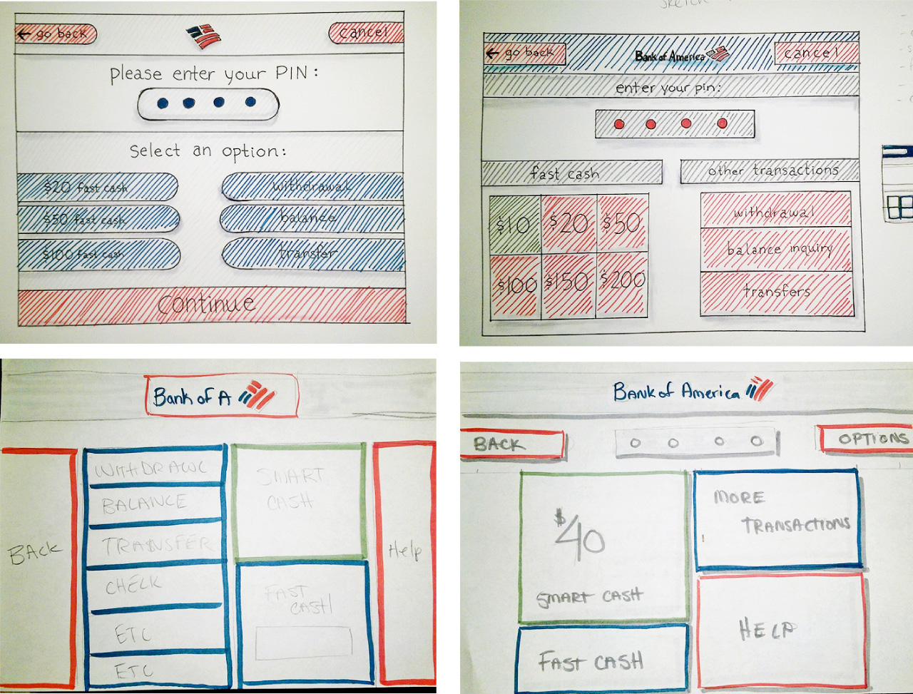
We experimented with different layouts and styles that would fit the feeling our users wanted the ATM interface to express. In the end, we decided on the bottom left layout because the large buttons are easy to see even in harsh lighting conditions and the interface is clean and modern. This design also has a Smart Cash option that remembers your most used settings to provide one click interactions at the ATM.
Final
